Amazon Rebrand
Amazon XCM
Global CCO VP: Jo Shoesmith
GCD: Alexa McNae and Chris See
Head of Brand Affinity: Jonathan Cohen
CD: Andrew Almeter and Lacy Muhich
Designers: Michael Woody, Melissa Bradley, Vanessa Hopkins, Jonathan Rinker, Celine Han, Ayako High
CW: Matthew Schnirman and Torin Daniels
Koto Studio
James Greenfield, Arthur Foliard, Alex Monger, Patrick Kolstad
Typography
NaN, Morisawa, and Matter Dubai
Awards
Type Directors Club 71
The One Show, Bronze
Communication Arts, Best Integrated Branding System
Amazon faced a defining challenge uniting over 50 distinct brands while preserving innovation that fueled its evolution from online bookstore to the third most valuable brand in the world. The solution: a fully rethought Brand Architecture and Design System that transforms complexity into meaningful customer connections. Built around Amazon’s signature orange and Smile logo, this system creates instant recognition while allowing each service to maintain its unique personality.
Through extensive collaboration between our in-house creative team at XCM and Koto Studio, a transformative framework emerged.
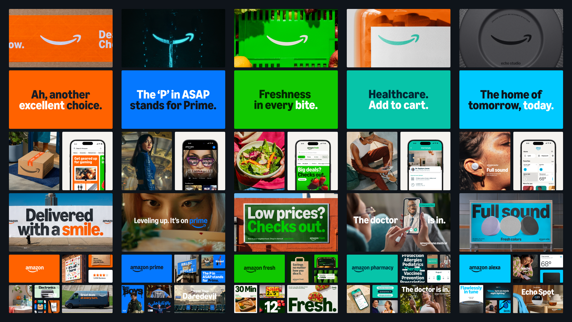
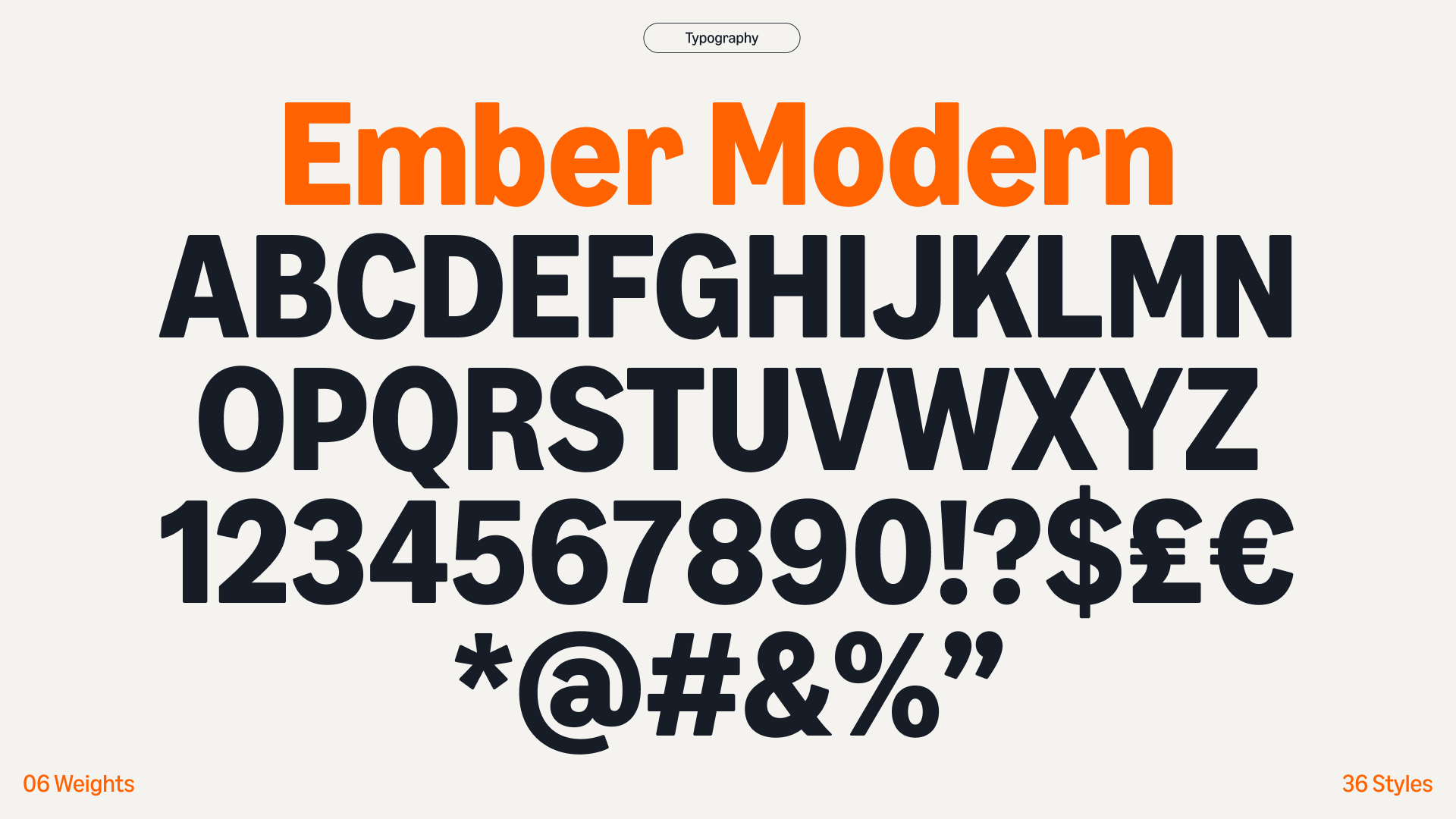
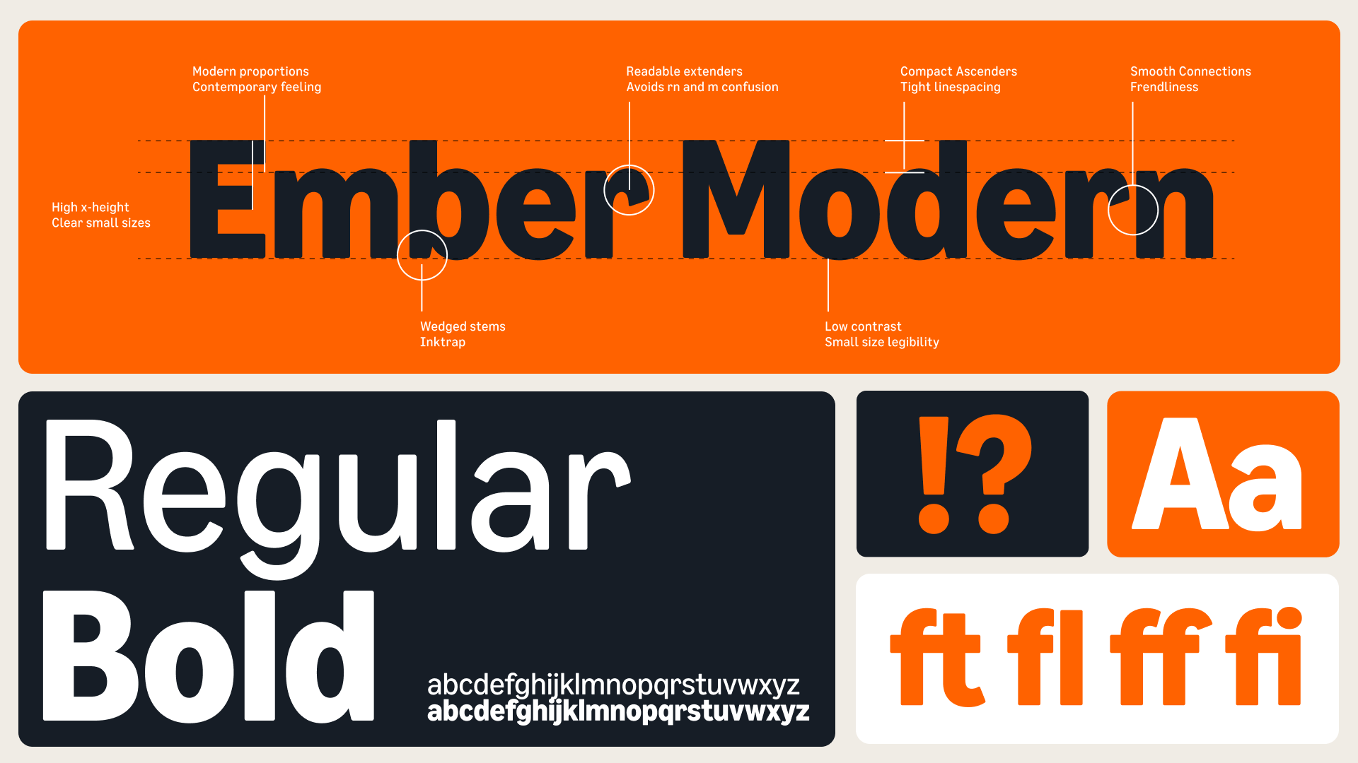
Our comprehensive brand redesign launched globally in less than a year and touched every aspect of Amazon's visual identity. At its core, we refined the Amazon logo and its iconic smile. We also developed a new brand typeface, Ember Modern that pays homage to the original Kindle font but with a new level modern expression. This new design system meticulously addressed all elements of our brand expression, creating a cohesive and modernized visual language for Amazon worldwide.
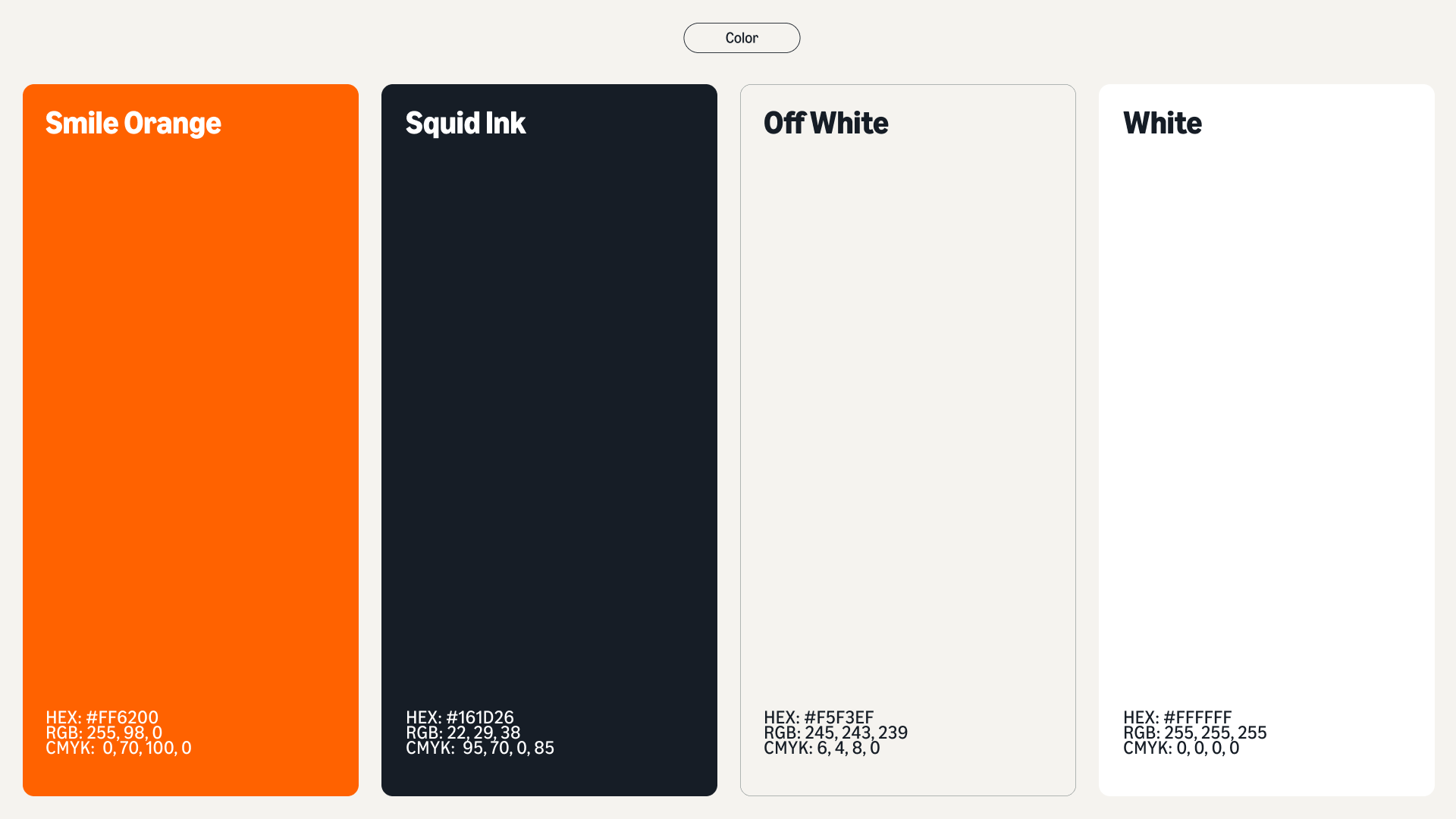
To help customers better recognize Amazon and engage with its full range of services, the new system created a more cohesive experience while preserving each service's unique personality through custom components of brand expression. In addition to the Amazon logo optimization and custom Ember Modern font, we created a new suite of accesssible brand colors as well as a new system for iconography, direction on brand voice, art direction, and motion design. We also developed an entirely new logo structure and philosophy for sub-brands to ensure consistency and cohesion across all of Amazon’s core offerings and businesses.


Designed to unite, built to scale.

Redefining retail expression
As an extension of the new brand design system, we simultaneously redefined how retail is expressed worldwide at Amazon, focusing on our optimized core brand color, Smile Orange, as well as the expressiveness of our new typeface, Ember Modern. Using these as core elements as the foundation for retail expression, we developed a distinct style of art direction, designed to convey optimism and warmth that when paired with our unique brand voice and tone, present a brand that is unmistakenly Amazon.